Pixel-Perfect UI With Custom CSS
Restricted featureThis is a restricted feature only available to selected partners. Please contact us if you are interested in using this feature.
If other customization options are not enough, the MetaKeep user wallet allows you to provide custom CSS for the UI elements to pixel-perfect your UI. You can customize the border-radius, border width, color, add a gradient, change the background-color, etc. Please read this detailed guide on which CSS properties, selectors and pseudo-classes are supported and how to use them.
Custom CSS is sanitizedFor user security, the custom CSS input is heavily sanitized. All unsupported CSS properties, selectors, and pseudo classes are removed. If you are not seeing the expected changes in the UI, please contact us.
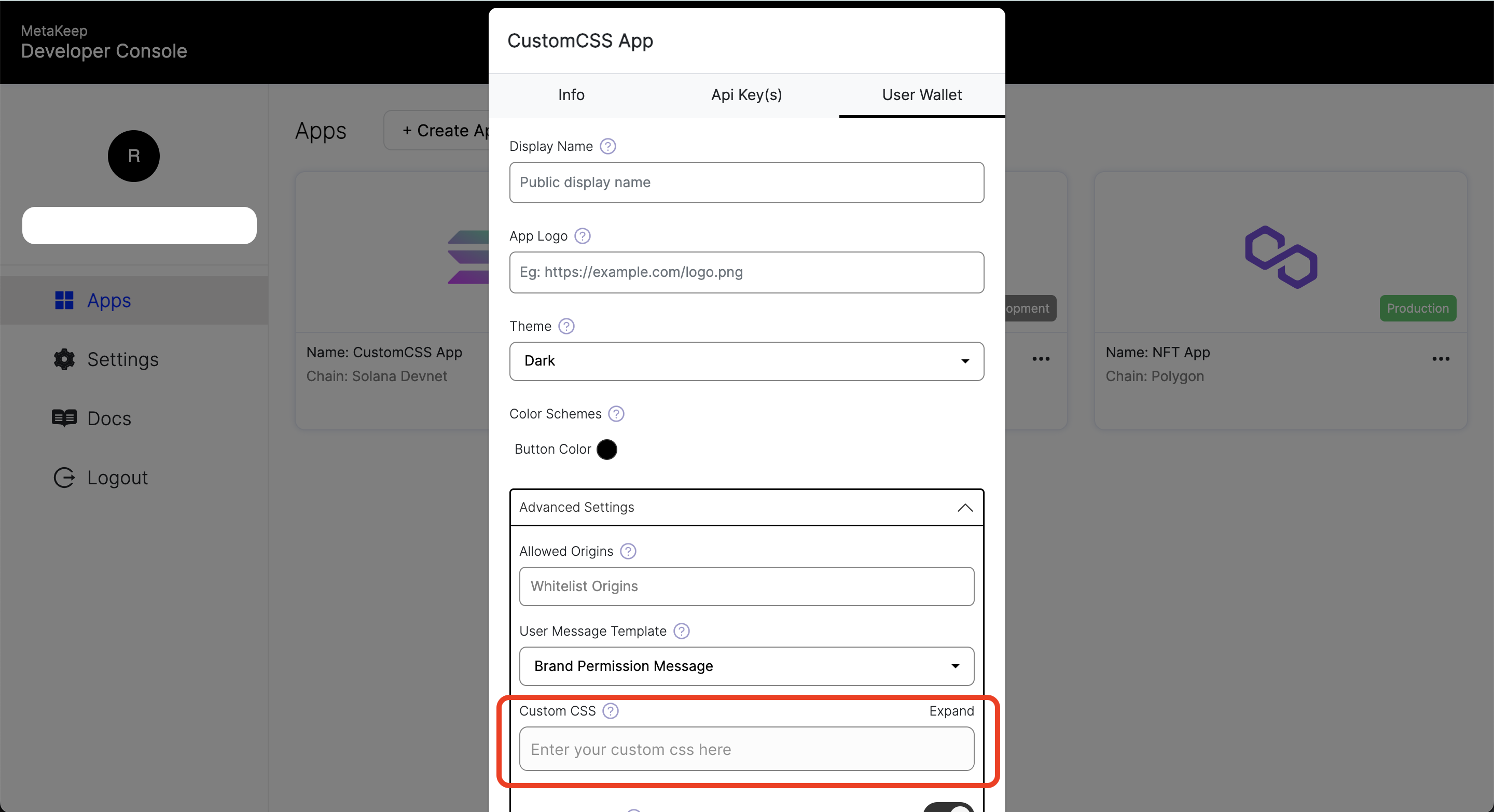
Provide custom CSS
Custom CSS can be provided in the Advanced Settings of the user wallet settings.
Primary button customization
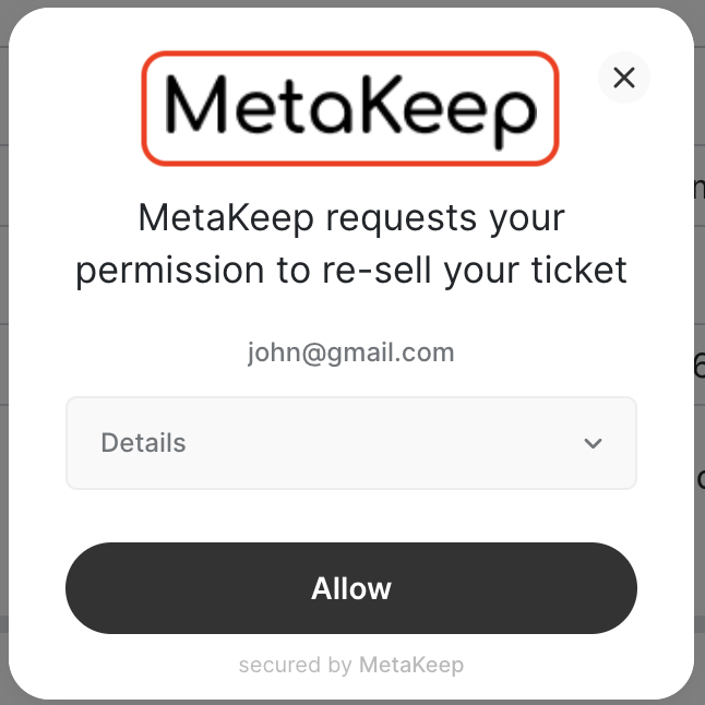
Using custom CSS, you can customize the primary button in the MetaKeep user wallet. The primary button is the button that is used for the primary action in the UI such as Allow, Confirm, Yes, No etc. Here's the image showing the primary button in the MetaKeep user wallet:
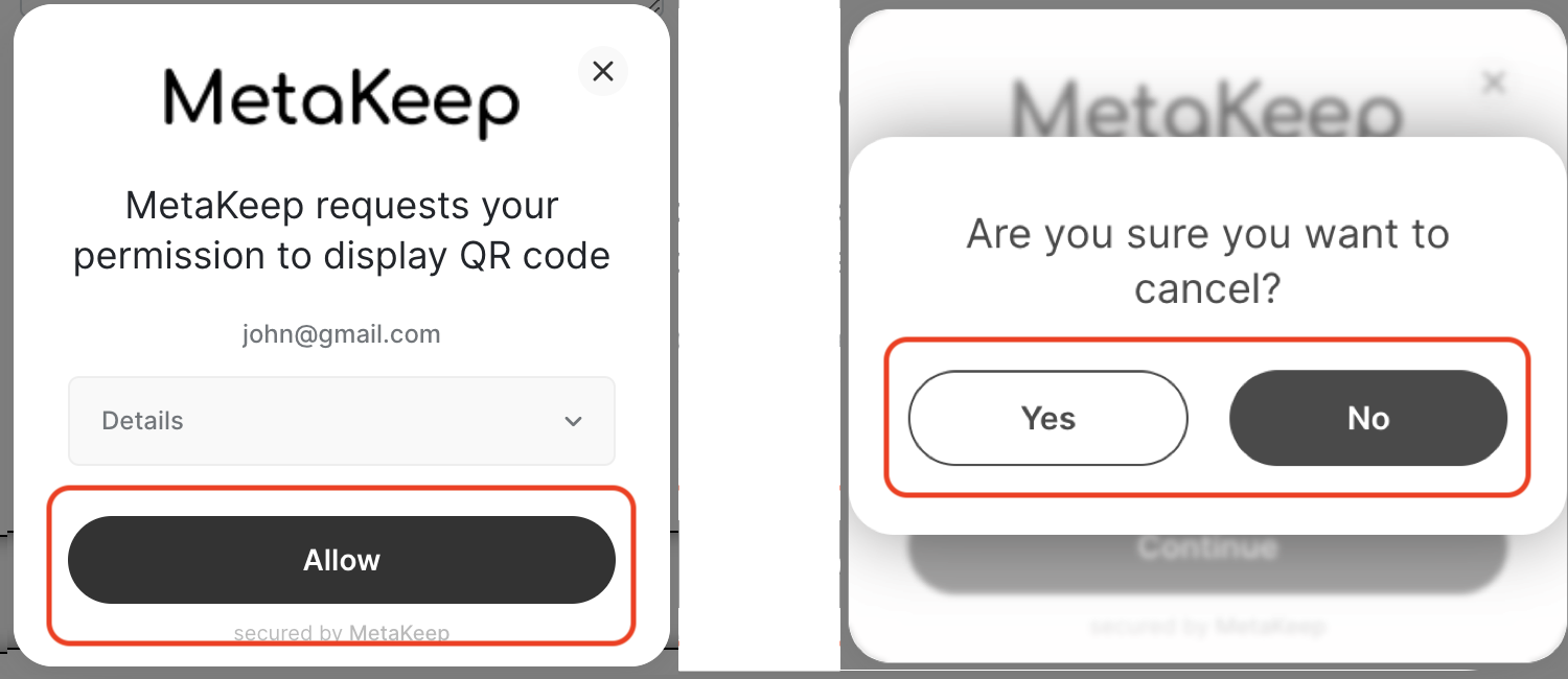
MetaKeep wallet buttons
CSS Selectors
The primary button can be customized using the following selectors:
.primary-button: The primary button..primary-button:hover: The primary button when hovered..primary-button-outlined: The primary button when outlined like theYesbutton in the picture above. This also inherits all the styles from the.primary-button..primary-button-outlined:hover: The primary button when outlined and hovered like theYesbutton in the picture above. This also inherits all the styles from the.primary-button:hover.
Supported CSS properties
.primary-button and .primary-button:hover support the following CSS properties:
background-color: The background color of the primary button e.g.red,#ff0000,rgb(255, 0, 0),rgb(255, 32, 0), etc. Note that the alpha channel is not supported.background: The background of the primary button e.g.linear-gradient(to right, red, yellow). Note that only linear gradients are supported currently for the background.border-radius: The border-radius of the primary button e.g.10px. Note thatremunit is not supported, useeminstead.border: The border of the primary button e.g.1px solid red. Please provide the full border value including the border style, width, and color, or else the border will not work as expected.color: The text color of the primary button e.g.red,#ff0000,rgb(255, 0, 0),rgb(255, 32, 0), etc. Note that the alpha channel is not supported.
.primary-button-outlined and .primary-button-outlined:hover support the following CSS properties:
color: The text color of the button e.g.red,#ff0000,rgb(255, 0, 0),rgb(255, 32, 0), etc. Note that the alpha channel is not supported.- Note that all styles from
.primary-buttonand.primary-button:hoverare inherited by default.
Examples
Customizing the primary button:
.primary-button {
  background-color: red;
  border-radius: 10px;
}
.primary-button {
color: white;
background-color: red;
border: 2px dashed blue;
}.primary-button {
background-color: red;
border-radius: 10px;
}
.primary-button:hover {
background-color: blue;
}.primary-button {
background: linear-gradient(to right, red, yellow);
border: 1px solid red;
color: white;
}.primary-button {
background: linear-gradient(to right, red, yellow);
border: 1px solid red;
color: white;
}
.primary-button:hover {
background: linear-gradient(to right, yellow, red);
border: 1px solid yellow;
}.primary-button {
background: linear-gradient(7deg, #c21ff4, #cf557a 52.08%, #fae429);
border-radius: 5px;
color: black;
}
.primary-button:hover {
background: linear-gradient(7deg, #fae429, #c21ff4 52.08%, #cf557a);
}Customizing the outlined button:
.primary-button {
  background-color: red;
  border-radius: 10px;
}

.primary-button-outlined {
  color: green;
}
Frame customization
Using custom CSS, you can customize the frame of the MetaKeep user wallet. The frame is the container of the MetaKeep user wallet. Here's the image showing the frame of the MetaKeep user wallet:
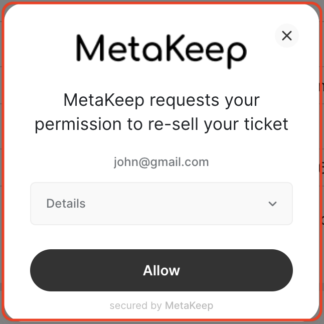
MetaKeep wallet frame
CSS Selectors
The frame can be customized using the following selector:
.frame-container: The frame of the MetaKeep user wallet.
Supported CSS properties
The following CSS properties are supported:
background-color: The background color of the frame e.g.red,#ff0000,rgb(255, 0, 0),rgb(255, 32, 0), etc. This should be used in conjunction with the wallet themeLIGHTorDARKto provide a consistent experience. Note that the alpha channel is not supported.border-radius: The border-radius of the frame e.g.10px. Note thatremunit is not supported, useeminstead.width: The width of the frame e.g.100%,500px, etc.
Media QueriesFrame customization supports media queries to apply different styles based on screen size.
Examples
Customizing the frame:
.frame-container {
  background-color: #c9e9f6;
}
.frame-container {
border-radius: 5px;
}@media (max-width: 600px) {
.frame-container {
width: 100%;
}
}Root customization
Using custom CSS, you can customize the root of the MetaKeep user wallet.
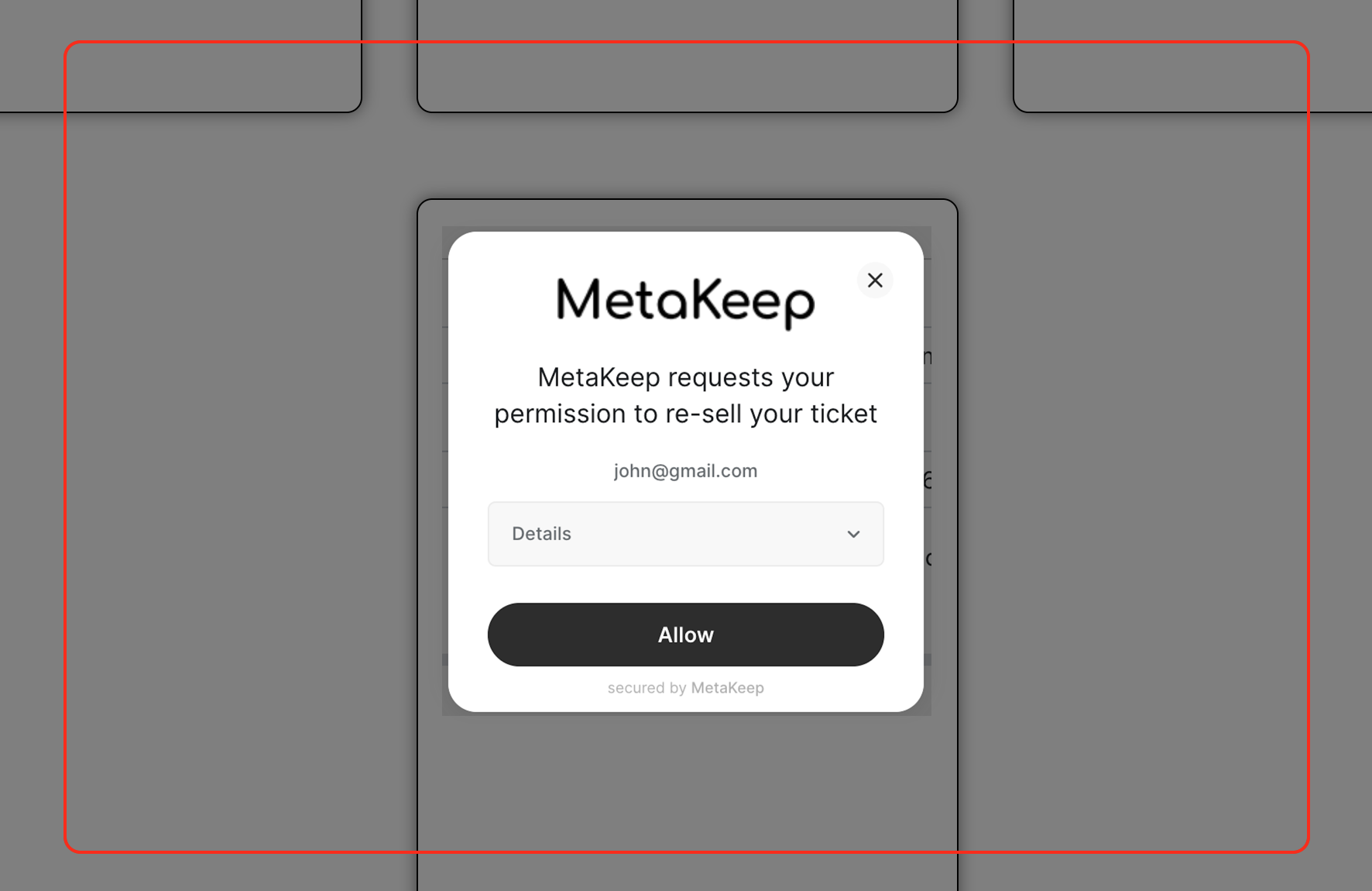
MetaKeep wallet root
CSS Selectors
The root can be customized using the following selector:
.root: The root container of the MetaKeep user wallet.
Supported CSS properties
The following CSS properties are supported:
background-color: The background color of the root container e.g.red,#ff0000,rgba(0, 0, 0, 0.5), etc. Note that the alpha channel is supported.align-items: The alignment of items within the root e.g.center,start,end, etc. This can be used to align the frame in the window.
Media QueriesRoot customization supports media queries to apply different styles based on screen size.
Examples
Customizing the root:
.root {
  background-color: rgba(0, 0, 0, 0.5);
}
.root {
background-color: rgba(0, 0, 0, 0);
}@media (max-width: 600px) {
.root {
align-items: end;
}
}Logo customization
Using custom CSS, you can customize the logo of the MetaKeep user wallet.
MetaKeep wallet logo
CSS Selectors
The logo can be customized using the following selector:
.logo: The logo element of the MetaKeep user wallet.
Supported CSS properties
The following CSS properties are supported:
display: The display property of the logo e.g.none, etc. This can be used to hide the logo.
Examples
Customizing the logo:
.logo {
  display: none;
}